
Both the users have different tasks but share the same goal, i.e. to complete the university application and meet the established university application deadline. A prospective student or applicant needs to keep a track of University application related information, personal information and documents that are required for the application process. A recommender on the other hand needs to know for whom and when is the recommendation pending. At the same time a recommender also has to keep a track of all the recommendation letters.
User Research
The literature review was supplemented by conducting semi-structured interviews and contextual inquiry. The goals of the interviews were analyze the problem of information management while working on university applications and verifying the insights gained during literature review. Three semi-structured interviews, two unstructured interviews and one contextual inquiry was conducted which involved a prospective student, three graduate students and two faculty members at Carnegie Mellon University.
It is hard to keep a track of specific requirements for each college. (for prospective students)
The applicants (prospective students) have to constantly look at their excel sheets or notebooks to determine approaching deadlines. There are no notifications.
Users (Prospective Students) do not carry all important documents everywhere and therefore are limited to completing their applications at home.
Applicants face many complications when asking for recommendations and trying to keep track of the recommendation status.
It is hard for the users to keep track of all the recommendation requests. They find it tedious to make a list of pending requests.
Some of the recommendation systems employed by University application administrations do not send deadline notifications.
The recommenders usually get 75-100 emails everyday because of their work profile and it is easy for a recommendation email to get lost in the email list.
Competitive Analysis
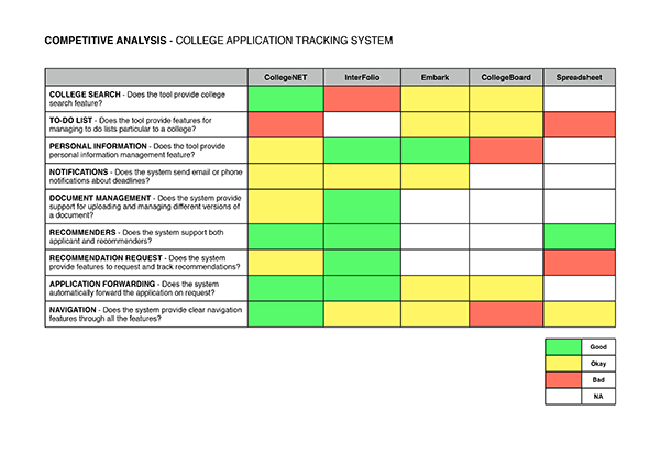
Before building the system, potential competitors already established in this market were evaluated. The competitive analysis covered CollegeNet, Interfolio, Embark, CollegeBoard and Spreadsheets. These systems were evaluated across pre-defined metrics. The analysis shows that most of the systems in this market address common issues but none address all the issues comprehensively.
Embark and CollegeBoard provide service for applicants but do not provide any support for recommenders. Their service is also limited to the high school applicants. The spreadsheets are the most commonly used solution but they fail to address the most frequent issues discovered during user research. CollegeNet and Interfolio are the giants in this market space and provide support for both applicants and recommenders. Although their service is comprehensive they still do not address the planning space in the university application process and provide no tools to organize them.

Low-Fidelity Sketches
After synthesizing the user interviews I created low-fidelity sketches for the interface. The interfaces were designed to provide easy navigation and retrieval of information with minimum cognitive overload.
Mid-Fidelity Wireframes
After creating basic sketches, I conducted an informal Heuristic Evaluation with other colleagues at the HCII Lab, who are also the domain experts. The heuristic evaluation focused mostly on finding out if the information organization established by the sketches were easy to understand and made sense. After analyzing the results I started to create wireframes to give the designs more structure. The wireframes were created in photoshop aiming to keep a simple and uncluttered design. Wireframes are presented on the top of the page.
User Evaluation
The persistent issues encountered during the university application planning were studied in depth and proposed solutions were prototyped. The prototype was made live on http://planforschool.net and was made available for further evaluation. Think-Aloud was conducted during the evaluation phase to assess the success of the system. A total of three users, a prospective student, a graduate student and a professor(recommender) participated in the think-aloud studies. For the think aloud, each user was given a set of tasks that an intended user would perform on the system. The user activity while performing the task was observed for any pre-established critical incidents that might affect the experience of user interaction with the system were noted down.
Usability Evaluation Results
The results of the evaluation were very promising. Users successfully completed the majority of assigned task. Users appreciated the system features for organizing the information and retrieving it back with minimum cognitive overload. Information hierarchy presented by the system made it easy for the users to understand the system quickly. The availability of deadline reminders was a value addition over the spreadsheets, which is the most commonly used system.
Users found the layout of the pages and navigation to be very intuitive and easy to use.
Users found the layout of the pages and navigation to be very intuitive and easy to use.
Users were confused about saving a new requirement to the to-do list and adding a new link for each college.
Users failed to add a new recommender to a particular college when no recommenders were on the list of common recommenders.
Future Direction
Users suggested extensions to the product that can be included in future releases. In order to look up and edit documents, previously added through the system, user had to download the document first. The users suggest that the system should include viewing and editing features so that documents could be viewed and edited online. They also think that a provision to save multiple versions of the same document would be very useful.
System should support online viewing and editing for documents.
Provisions to maintain multiple versions of the document would be helpful.
Presentation Slides